dev-resources.site
for different kinds of informations.
Streamline Your Progress Navigation with the New .NET MAUI StepProgressBar
TLDR: Showcasing the features of the new Syncfusion .NET MAUI StepProgressBar control with vivid, picturesque illustrations and the steps to get started.
We are thrilled to announce an exciting update for our community! With unveiling the 2024 Vol 1 release in the Syncfusion .NET MAUI suite, we’re introducing a groundbreaking addition that promises to revolutionize your app design and user interaction: the all-new .NET MAUI StepProgressBar control!
The new .NET MAUI StepProgressBar is a control that indicates the progress of a multiple-step (state) process. Users can utilize this control to track the progress of online purchases, new user registrations, and the live location of buses, trains, and flights.
Let’s explore its vivid features!
Key features
The key features of the .NET MAUI StepProgressBar control are as follows:
- Orientation
- Status
- Customizable descriptions
- Flexible label positioning
- Step content customization
- Step shape customization
Orientation
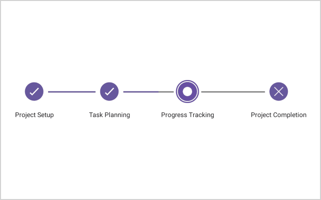
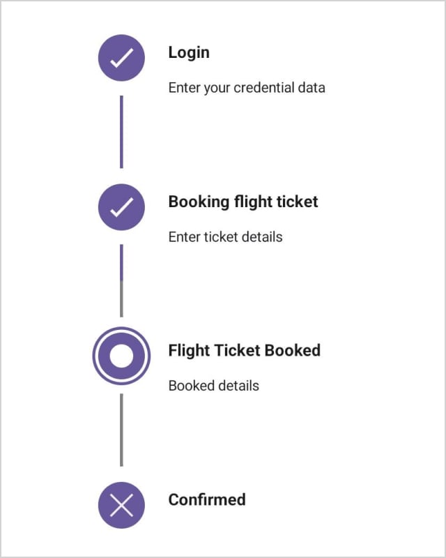
Visualize the progression of a multi-step process horizontally or vertically, providing layout flexibility to integrate the StepProgressBar into various app designs seamlessly.
Status
The active step index and progress value determine the status of a step, which can be one of three:
- Not started – This signifies that the step has yet to begin.
- In progress – This shows that the step is being worked on.
- Completed – Indicates that the step has been successfully finished.
Customizable descriptions
Steps can include descriptions on either side or both sides. The primary description typically appears on the right (in vertical progress bars) or at the bottom (in horizontal progress bars). In contrast, the secondary description is positioned on the left or top. You can also customize these descriptions using the formatting options.
Flexible label positioning
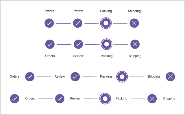
Labels can be positioned in four ways: start, end, top, and bottom in horizontal and vertical orientations, offering flexibility in how information is displayed alongside the progress bar.
Step content customization
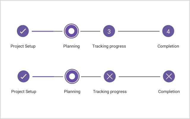
Customize the content of each step with numbers, ticks, crosses, dots, or images, allowing for enhanced visual representation.
Step shape customization
Choose between circles or squares to tailor the visual appearance of each step, aligning perfectly with your app’s design.
Note: For more details, refer to the .NET MAUI StepProgressBar control documentation.
Getting started with the .NET MAUI StepProgressBar control
We have seen the key features of the .NET MAUI StepProgressBar control. Now, let’s learn how to integrate it into your .NET MAUI app and utilize its features:
Step 1: Create a .NET MAUI app
First, create a .NET MAUI application.
Step 2: Add the .NET MAUI ProgressBar NuGet package
Syncfusion .NET MAUI controls are available in the NuGet gallery. To add the .NET MAUI StepProgressBar control to your project, open the NuGet package manager in Visual Studio, search for Syncfusion.Maui.ProgressBar, and install it.
Step 3: Register the handler
In the MauiProgram.cs file, register the handler for Syncfusion core. Refer to the following code.
using Syncfusion.Maui.Core.Hosting;

public static class MauiProgram
{
    public static MauiApp CreateMauiApp()
    {
        var builder = MauiApp.CreateBuilder();
        builder
          .UseMauiApp<App>()
          .ConfigureSyncfusionCore()
          .ConfigureFonts(fonts =>
          {
              fonts.AddFont("OpenSans-Regular.ttf", "OpenSansRegular");
              fonts.AddFont("OpenSans-Semibold.ttf", "OpenSansSemibold");
              fonts.AddFont("Roboto-Medium.ttf", "Roboto-Medium");
              fonts.AddFont("Roboto-Regular.ttf", "Roboto-Regular");
          });
        return builder. Build();
    }
}
Step 4: Add the namespace
Add the Syncfusion.Maui.ProgressBar namespace in your XAML page.
xmlns:progressBar="clr-namespace:Syncfusion.Maui.ProgressBar;assembly=Syncfusion.Maui.ProgressBar"
Step 5: Initialize the Syncfusion .NET MAUI StepProgressBar control
Finally, initialize the Syncfusion .NET MAUI StepProgressBar control. Refer to the following code examples.
XAML
<Grid>
 <Grid.RowDefinitions>
  <RowDefinition Height="0.07*"/>
  <RowDefinition Height="0.8*"/>
 </Grid.RowDefinitions>

 <Label Grid.Row="0" Text="Out for Delivery" FontAttributes="Bold" Padding="0,10,0,0" Style="{StaticResource labelStyle}" HorizontalOptions="Center"/>
 <BoxView Grid.Row="0" HeightRequest="1" BackgroundColor="{AppThemeBinding Light={StaticResource Border}, Dark={StaticResource Border}}" VerticalOptions="End" HorizontalOptions="Fill"/>
 <ScrollView Orientation="Vertical" Grid.Row="1" VerticalScrollBarVisibility="Never">
  <progressBar:SfStepProgressBar ItemsSource="{Binding ShipmentInfoCollection}"
                                 Orientation="Vertical"
                                 x:Name="stepProgress"
                                 Margin="24,10,0,0"
                                 LabelSpacing="12"
                                 ProgressAnimationDuration="2000"
                                 ActiveStepIndex="3"
                                 ActiveStepProgressValue="50">
   <progressBar:SfStepProgressBar.CompletedStepSettings>
    <progressBar:StepSettings Background="Green" ProgressColor="Green"/>
   </progressBar:SfStepProgressBar.CompletedStepSettings>

   <progressBar:SfStepProgressBar.InProgressStepSettings>
    <progressBar:StepSettings ProgressColor="Green"/>
   </progressBar:SfStepProgressBar.InProgressStepSettings>

  </progressBar:SfStepProgressBar>
 </ScrollView>
</Grid>
C#
public class ViewModel : INotifyPropertyChanged
{
        /// <summary>
        /// The order formatted string.
        /// </summary>
        private FormattedString orderFormattedString;

        /// <summary>
        /// The shipped formatted string.
        /// </summary>
        private FormattedString shippedFormattedString;

        /// <summary>
        /// The out for delivery formatted string.
        /// </summary>
        private FormattedString outForDeliveryFormattedString;

        /// <summary>
        /// The delivery formatted string.
        /// </summary>
        private FormattedString deliveryFormattedString;

        /// <summary>
        /// The shipment collection.
        /// </summary>
        private ObservableCollection<StepProgressBarItem> shipmentInfoCollection;

        public event PropertyChangedEventHandler? PropertyChanged;

        /// <summary>
        /// The shipment collection.
        /// </summary>
        public ObservableCollection<StepProgressBarItem> ShipmentInfoCollection
        {
            get { return shipmentInfoCollection; }
            set
            {
                if (shipmentInfoCollection != value)
                {
                    shipmentInfoCollection = value;
                    OnPropertyChanged(nameof(ShipmentInfoCollection));
                }
            }
        }

        /// <summary>
        /// Check whether the application theme is light or dark.
        /// </summary>
        private bool isLightTheme = Application.Current?.RequestedTheme == AppTheme.Light;

        public ViewModel()
        {
            var currentDate = DateTime.Now.AddDays(-2);
            orderFormattedString = new FormattedString();
            orderFormattedString.Spans.Add(new Span { Text = "Order Confirmed", FontSize = 14, TextColor = isLightTheme? Color.FromRgb(28, 28, 28) : Colors.White, FontFamily ="Roboto-Medium" });
            orderFormattedString.Spans.Add(new Span { Text = "\n ", FontSize = 8 });
            orderFormattedString.Spans.Add(new Span { Text = "\nYour purchase has been confirmed.", FontSize = 12, TextColor = isLightTheme ? Color.FromRgba("#1C1B1F") : Color.FromRgba("#E6E1E5"), FontFamily = "Roboto-Regular" });
            orderFormattedString.Spans.Add(new Span { Text = "\n" + GetFormattedDateText(currentDate), FontSize = 12, TextColor = isLightTheme ? Color.FromRgb(99, 99, 99) : Color.FromRgba("#CAC4D0"), FontFamily = "Roboto-Regular" });
            orderFormattedString.Spans.Add(new Span { Text = "\n ", FontSize = 8, });
            orderFormattedString.Spans.Add(new Span { Text = "\nYour order has been picked up by courier partner.", FontSize = 12, TextColor = isLightTheme ? Color.FromRgba("#1C1B1F") : Color.FromRgba("#E6E1E5"), FontFamily = "Roboto-Regular" });
            orderFormattedString.Spans.Add(new Span { Text = "\n" + GetFormattedDateText(currentDate.AddHours(5)), FontSize = 12, TextColor = isLightTheme ? Color.FromRgb(99, 99, 99) : Color.FromRgba("#CAC4D0"), FontFamily = "Roboto-Regular" });

            shippedFormattedString = new FormattedString();
            shippedFormattedString.Spans.Add(new Span { Text = "Shipped", FontSize = 14, TextColor = isLightTheme ? Color.FromRgb(28, 28, 28) : Colors.White, FontFamily = "Roboto-Medium" });
            shippedFormattedString.Spans.Add(new Span { Text = "\n ", FontSize = 8 });
            shippedFormattedString.Spans.Add(new Span { Text = "\nYour order is on its way.", FontSize = 12, TextColor = isLightTheme ? Color.FromRgba("#1C1B1F") : Color.FromRgba("#E6E1E5"), FontFamily = "Roboto-Regular" });
            shippedFormattedString.Spans.Add(new Span { Text = "\n" + GetFormattedDateText(currentDate.AddHours(5).AddMinutes(30)), FontSize = 12, TextColor = isLightTheme ? Color.FromRgb(99, 99, 99) : Color.FromRgba("#CAC4D0"), FontFamily = "Roboto-Regular" });
            shippedFormattedString.Spans.Add(new Span { Text = "\n ", FontSize = 8, });
            shippedFormattedString.Spans.Add(new Span { Text = "\nYour order has been received in the hub nearest to you.", FontSize = 12, TextColor = isLightTheme ? Color.FromRgba("#1C1B1F") : Color.FromRgba("#E6E1E5"), FontFamily = "Roboto-Regular" });
            shippedFormattedString.Spans.Add(new Span { Text = "\n" + GetFormattedDateText(currentDate.AddHours(7).AddMinutes(30)), FontSize = 12, TextColor = isLightTheme ? Color.FromRgb(99, 99, 99) : Color.FromRgba("#CAC4D0"), FontFamily = "Roboto-Regular" });

            outForDeliveryFormattedString = new FormattedString();
            outForDeliveryFormattedString.Spans.Add(new Span { Text = "Out For Delivery", FontSize = 14, TextColor = isLightTheme ? Color.FromRgb(28, 28, 28) : Colors.White, FontFamily = "Roboto-Medium" });
            outForDeliveryFormattedString.Spans.Add(new Span { Text = "\n ", FontSize = 8 });
            outForDeliveryFormattedString.Spans.Add(new Span { Text = "\nYour order is out for delivery.", FontSize = 12, TextColor = isLightTheme ? Color.FromRgba("#1C1B1F") : Color.FromRgba("#E6E1E5"), FontFamily = "Roboto-Regular" });
            outForDeliveryFormattedString.Spans.Add(new Span { Text = "\n" + GetFormattedDateText(currentDate.AddDays(2).AddHours(-2)), FontSize = 12, TextColor = isLightTheme ? Color.FromRgb(99, 99, 99) : Color.FromRgba("#CAC4D0"), FontFamily = "Roboto-Regular" });
            outForDeliveryFormattedString.Spans.Add(new Span { Text = "\n", FontSize = 5 });

            deliveryFormattedString = new FormattedString();
            deliveryFormattedString.Spans.Add(new Span { Text = "Delivery Expected By " + DateTime.Now.ToString($"ddd, d'{this.GetDaySuffix(DateTime.Now)}' MMM"), FontSize = 14, TextColor = isLightTheme ? Color.FromRgb(99, 99, 99) : Color.FromRgba("#CAC4D0"), FontFamily = "Roboto-Medium" });
            deliveryFormattedString.Spans.Add(new Span { Text = "\n ", FontSize = 8 });
            deliveryFormattedString.Spans.Add(new Span { Text = "\nItem yet to be delivered.", FontSize = 12, TextColor = isLightTheme ? Color.FromRgb(99, 99, 99) : Color.FromRgba("#CAC4D0"), FontFamily = "Roboto-Regular" });
            deliveryFormattedString.Spans.Add(new Span { Text = "\nExpected by " + DateTime.Now.ToString($"ddd, d'{this.GetDaySuffix(DateTime.Now)}' MMM") + " at " + DateTime.Now.AddHours(1).ToString("h:mm tt"), FontSize = 12, TextColor = isLightTheme ? Color.FromRgb(99, 99, 99) : Color.FromRgba("#CAC4D0"), FontFamily = "Roboto-Regular" });
            deliveryFormattedString.Spans.Add(new Span { Text = "\n", FontSize = 5 });

            shipmentInfoCollection = new ObservableCollection<StepProgressBarItem>();
            shipmentInfoCollection.Add(new StepProgressBarItem() { PrimaryFormattedText = orderFormattedString });
            shipmentInfoCollection.Add(new StepProgressBarItem() { PrimaryFormattedText = shippedFormattedString });
            shipmentInfoCollection.Add(new StepProgressBarItem() { PrimaryFormattedText = outForDeliveryFormattedString });
            shipmentInfoCollection.Add(new StepProgressBarItem() { PrimaryFormattedText = deliveryFormattedString });
        }

        private string GetFormattedDateText(DateTime dateTime)
        {
            string formattedDate = dateTime.ToString("ddd, d MMM \\'yy 'at' h:mm tt");
            return formattedDate;
        }

        private string GetDaySuffix(DateTime dateTime)
        {
            string daySuffix;
            switch (dateTime.Day % 10)
            {
                case 1 when dateTime.Day != 11:
                    daySuffix = "st";
                    break;
                case 2 when dateTime.Day != 12:
                    daySuffix = "nd";
                    break;
                case 3 when dateTime.Day != 13:
                    daySuffix = "rd";
                    break;
                default:
                    daySuffix = "th";
                    break;
            }

            return daySuffix;
        }

        protected virtual void OnPropertyChanged(string propertyName)
        {
            PropertyChanged?.Invoke(this, new PropertyChangedEventArgs(propertyName));
        }
}
After executing the previous code examples, we’ll get the output in the following image.
GitHub references
For more details, refer to the .NET MAUI StepProgressBar Control demo on GitHub.
Conclusion
Thanks for reading! This blog explored the features of the new Syncfusion .NET MAUI StepProgressBar rolled out in the 2024 Volume 1 release. You can learn more about the latest .NET MAUI advancements on our Release Notes and What’s New pages. Try them out and leave your feedback in the comments section below!
Download Essential Studio for .NET MAUI to start evaluating them immediately.
If you have any questions, contact us through our support forum, support portal, or feedback portal. We are always happy to help you!
Related blogs
Featured ones:


