dev-resources.site
for different kinds of informations.
Support Time to Take Action with Compose
While working on my master's thesis and the Android Accessibility Checklist, one of the answers to my survey mentioned an accessibility setting called time to take action. Since then, I've been curious about it and wanted to write a blog post as I feel it's one of the undersupported accessibility settings and really useful for those who utilize it.
So, what is time to take action, and why would someone use it? And why should we, as developers, care? Let's talk about that first.
Time to Take Action
Time to take action is a setting that controls the minimum time in which temporary messages asking a user to take action are shown. So, for example, when you press the volume buttons on your Android phone, you should see the volume controls next to the volume buttons, and this setting controls how long they're visible.
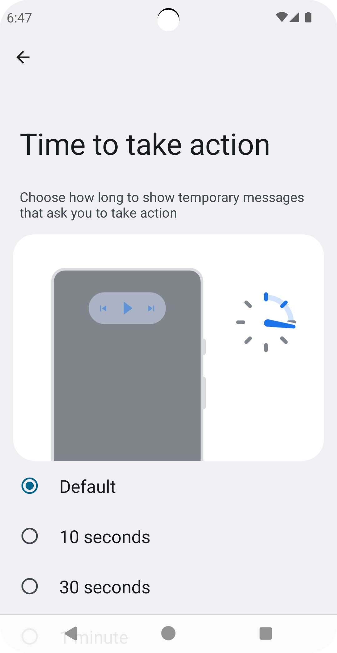
This setting has different options: Default, 10 seconds, 30 seconds, 1 minute and 2 minutes. You can find them from Settings -> Accessibility Settings -> Timing controls -> Time to take action (Accessibility timeout). The screen looks something like this, depending on your phone's version and manufacturer:
And why would someone need this setting? Well, the source code and documentation for a method we're going to use in a moment puts it pretty well:
Some users may need extra time to review the controls, or to reach them, or to activate assistive technology to activate the controls automatically.
Okay, now we've established what the time to take action is. However, the question of relevance remains: Why should we care as developers? Isn't it something that the operating system handles automatically?
The answer is yes and no. Most components on the operating system level and Material3 components respect this setting. However, when you're building a custom component, it's not automatically respected, and you'll need to add support for it. That's why the settings page mentions that not all apps support the setting. The thing is, developers usually don't know about it.
Let's next talk about how to support time to take action-setting with a custom component.
How to Respect Time to Take Action?
For the sake of example, we'll build a small tooltip component with a button to close it. The tooltip disappears after the minimum time to take action if the user does nothing. The default value, in our case, is set to 10 seconds.
Before diving into code, here's a video where the tooltip is first shown with the time to take action setting with a default value, and then it's set to 30 seconds:
This example doesn't contain all the code (like the tooltip content), just the relevant parts. As seen in the video, the tooltip becomes visible after the user clicks an "Info"-button, then is visible for the required time, depending on the time to take action-setting, and finally, disappears. The tooltip contains a button to hide the tooltip faster.
We're adding the support for time to take action in two steps:
- Calculate the delay for hiding the tooltip
- Hide the tooltip after the calculated time has passed
The first step is to calculate the delay, or tooltipTimeout, as we're calling it in the code:
@Composable
fun Tooltip(
    tooltipVisible: Boolean,
    hideTooltip: () -> Unit,
    modifier: Modifier = Modifier
) {
    val tooltipTimeout = LocalAccessibilityManager.current?
        .calculateRecommendedTimeoutMillis(
             originalTimeoutMillis = TOOLTIP_DEFAULT_TIMEOUT_MS,
             containsText = true,
             containsControls = true,
         ) ?: TOOLTIP_DEFAULT_TIMEOUT_MS

    ...

    TooltipContent(...)
}

// 10 seconds
const val TOOLTIP_DEFAULT_TIMEOUT_MS = 10000
LocalAccessibilityManager composition local provides a neat function for calculating the timeout, so we use that.
The first parameter for calculateRecommendedTimeoutMillis is the original timeout milliseconds, which applies when there are no accessibility timeout needs. The other parameters are a bunch of boolean values informing about the element's contents for which the timeout value is being calculated. These are about whether the element contains text, controls, or icons.
The calculateRecommendedTimeoutMillis returns the recommended timeout time as Long. As the AccessibilityManager might not be available in some operating systems or OS versions and thus is nullable, we also need a default value. This value is the TOOLTIP_DEFAULT_TIMEOUT_MS in our code - the same one we use for the original timeout. In the example, the value is 10 seconds.
Next, we'll use the freshly calculated timeout:
@Composable
fun Tooltip(...) {

   ...

    LaunchedEffect(tooltipVisible) {
        if (tooltipVisible) {
            delay(tooltipTimeout)
            hideTooltip()
        }
    }

    TooltipContent(...)
}
So, what happens in the code snippet is that whenever the tooltipVisible-value changes, we check if the change was for making the tooltip visible, and if so, then we first delay for the number of milliseconds we calculated in the previous step and then hide the tooltip.
This way, we can respect the user's settings for elements that they might need more time to interact with.
Wrapping Up
In this blog post, we've discussed the time to take action setting, what it is, why developers should know about it, and how to respect it. We've done this by building a tooltip component, which hides after a certain amount of time.
Did you know about this setting? Have you ever implemented support for it? If so, what kind of UI components were they?
Links in the Blog Post
Featured ones:
